Context
Prioticket is a company based in Amsterdam, offering a sales tool for the travel industry. It is one of the most complete tools on the market and it is used by companies such as CitySightseeing, Contiki, Evan Evans and AttractionWorld.
I joined Prioticket in November 2020 as an Intern, and my internship later turned into a traineeship. During my traineeship, I was put in charge of redesigning the points of sales to make them fit with the new API. This was a huge challenge, because everything was still under discussion. My designs were also helpful in that they raised difficult questions that had to be answered.
Requirements and constraints
The products that I worked on can be activated by the client from the main tool. The requirements vary a lot from client to client, so I had to consider all the possible scenarios and create just enough settings to satisfy everyone. In addition to this, the products were going to be developed with Flutter and needed to share as much code as possible. I kept this in consideration in my designs, and I only introduced changes when it was necessary to improve UX on the specific devices.
My role
I was the main designer behind these products. I had regular meetings with the Points Of Sale PM and the CTO to figure out client and technical requirements, while I advocated for user requirements. The main Product Designer at Prioticket also mentored me throughout the project and gave me very precious advice on how to handle stakeholders.
Self-Service Kiosk
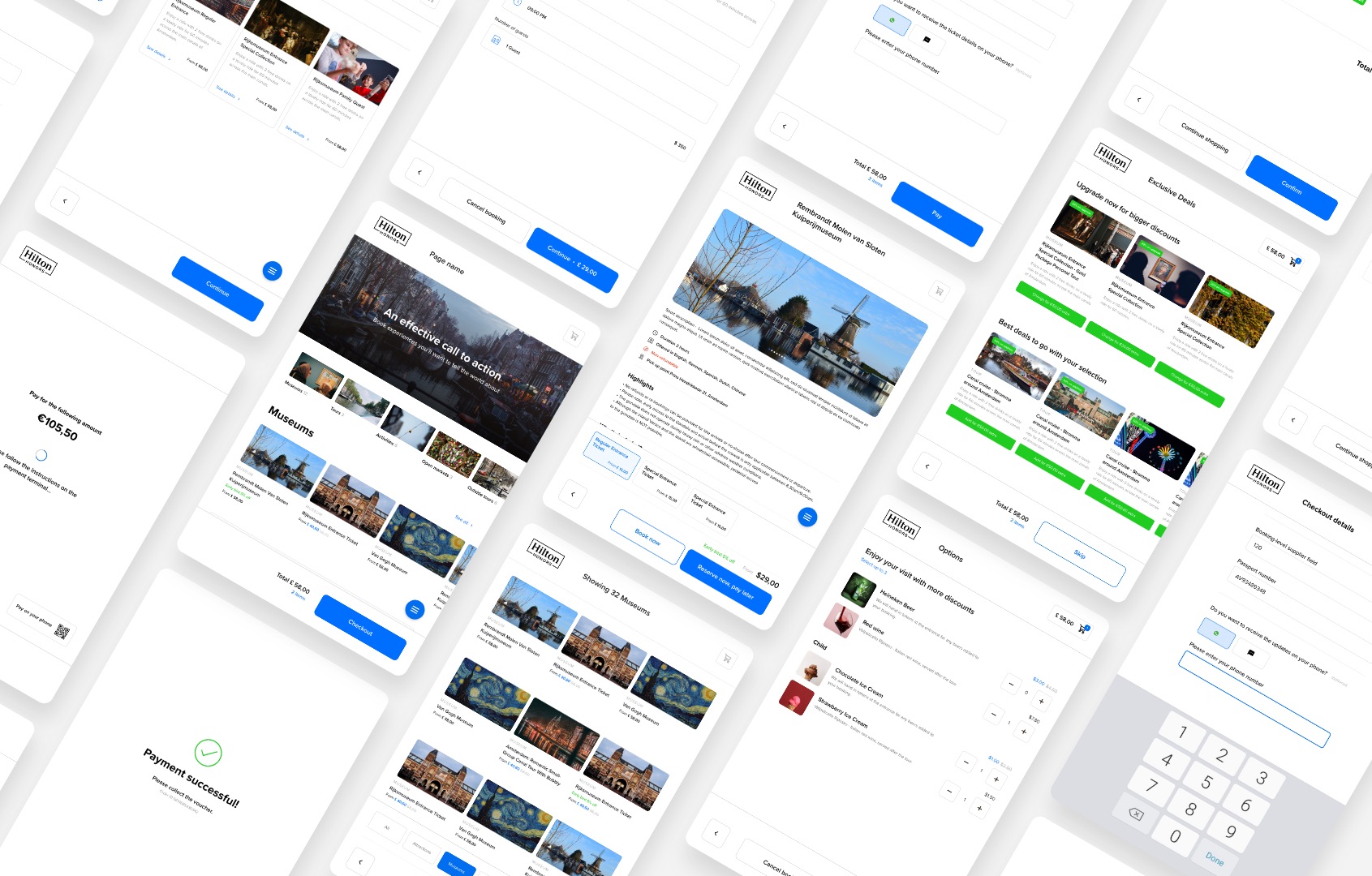
The company already had a self-service kiosk but it was lacking many features and it didn't integrate with the latest API version. In order to optimize development speed, we tried to merge the flow together with the Customer App (a B2C mobile app), while taking into account the difference in terms of interaction on the two devices.
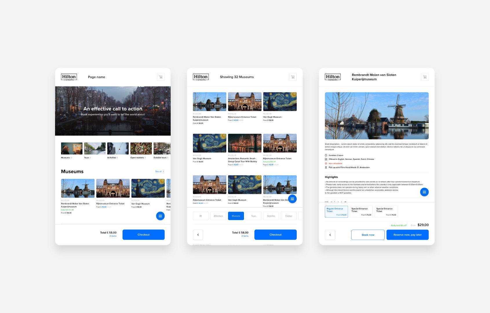
The flow starts with a custom page made up of different sections. The client will be able to customize each section and sort them, similar to what we already do with another existing point of sale, the custom website. They can link a button to a list of products, another custom page, or a product page.
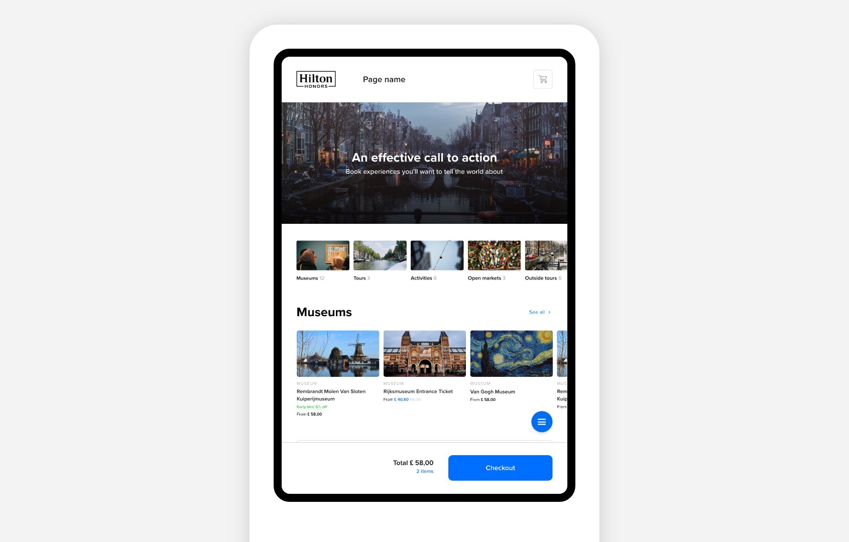
One of the unique value propositions of the product is the possibility of adding a "Reserve now, pay later" flow. In this case, the customer will provide an email and, optionally, a phone number. Then they will receive a secure link to their personal page, from which they can pay and check-in, amend the booking or cancel it.
Customer App
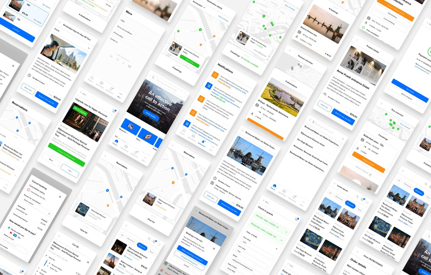 The customer app is another customer-facing POS that the clients can generate from Prioticket. We chose to differentiate it from the Host app, which is a B2B POS. The objective for this app was to give users a way to both make reservations and manage the reservations they made. In short, it needed to integrate the shop flow with the personal page on the web, for which a design was already available.
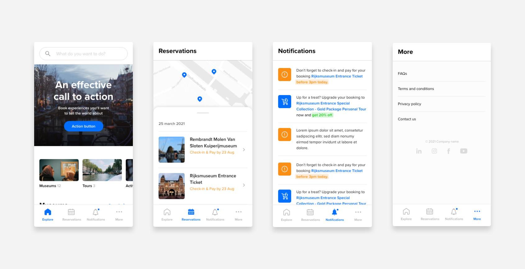
We settled on splitting the functionality into different tabs: Explore, Reservations, Notifications and More.
Reservations
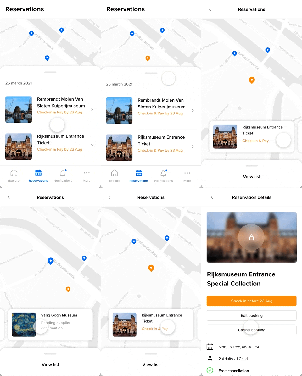
The "Reservations" tab is where the user can manage their reservations. For example, they can pay for bookings made with the "Reserve now, pay later" feature, edit bookings or cancel them.
The UI follows that of map-based apps like Google Maps and Airbnb. With a vertical drag gesture the user can switch between list view and map view. This is especially useful for certain products, like clusters, itineraries and passes, as the user can easily add products to the trip.s
Cashier POS
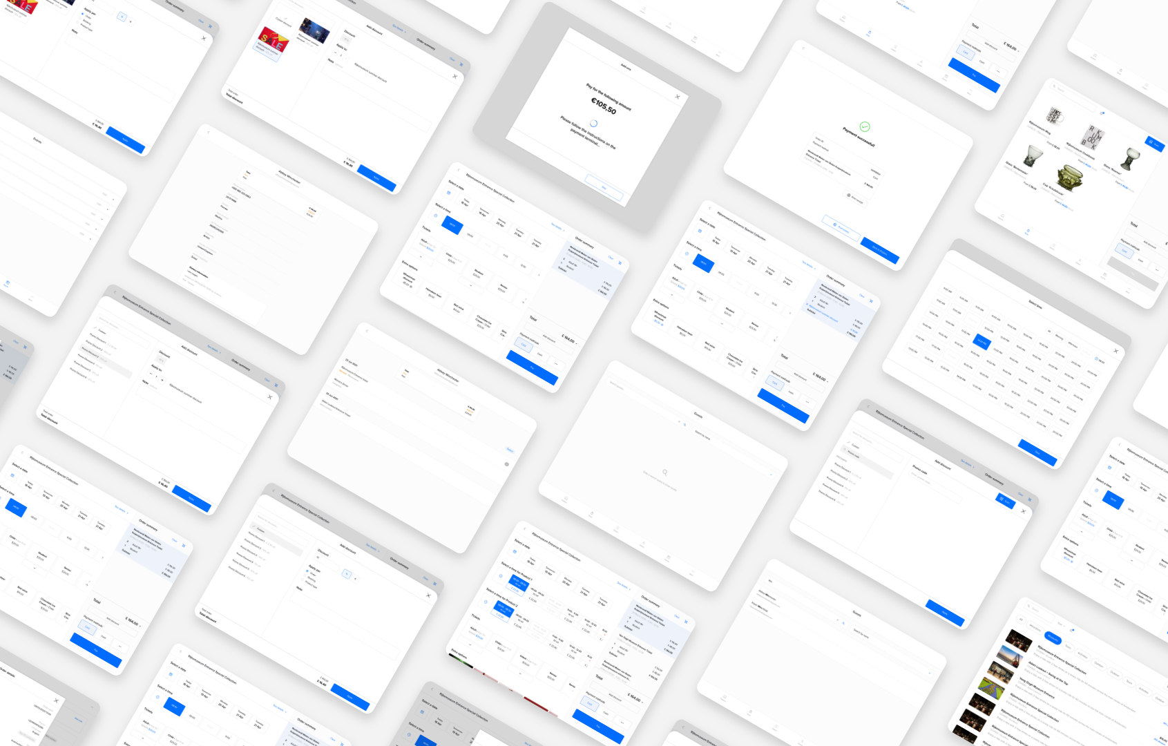
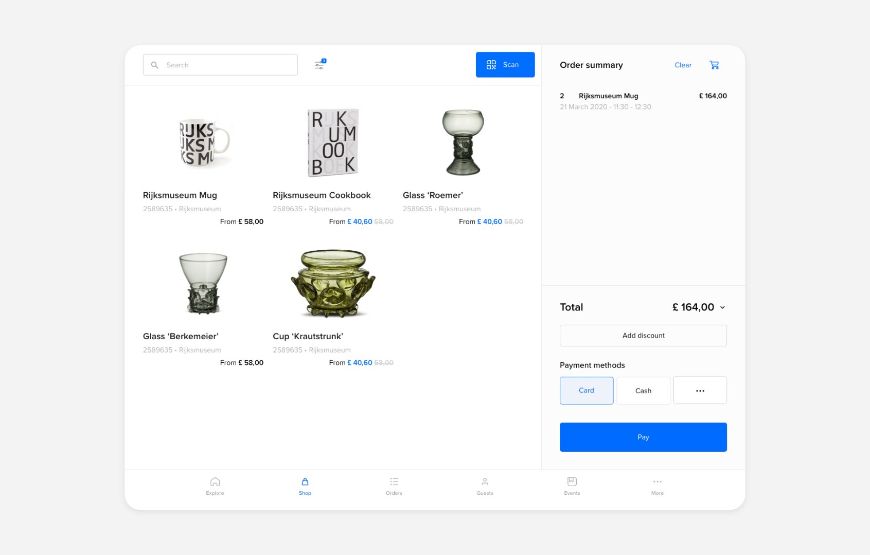
As for the self-service kiosk, the company already had a Cashier POS app, but it was lacking a lot of functionality. In my redesign, I tried to reuse most of the flow from the Kiosk and the Customer App, but I had to take in consideration the different use cases. In the Cashier POS, the supplier's employees need to make a few repetitive actions very quickly, and chances are they'll get to know the UI well. Hence, quite counter-intuitively, we chose to make a single page full of information rather than a multi-page, step-by-step flow.
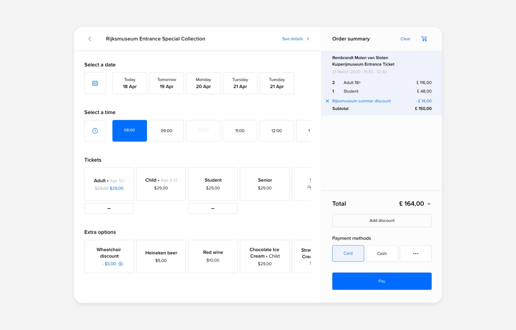
We also added a tab to easily sell merchandise items, which many clients requested. In this case, items are added to the cart without going through the booking screen. The cart can be hidden or shown at any time on both the merchandise shop and the standard shop, following a common iPad pattern.
Reflections on UX
Prioticket's business model consists in getting new clients to pay for the features they need, which can then be resold to other clients. On the short term, this is great. However, new features increase complexity exponentially, both for us and the users. Unfortunately, clients often don't care about how usable an enterprise tool is: they will sign a contract as long as it has the features they request. This leads to an environment where UX has little to no return on investment.
Many times I've felt like we were going out of our way for one bad actor and penalizing all the good ones. There are features that add a huge overhead that only one client uses. This is what happens with a low-volume, high-margin business model like Prioticket's.
The B2C products that I worked on were interesting because they were one of the few exceptions among Prioticket's products where investing in UX can actually increase sales. This benefits both us and the client. Ideally, in the future I'd like to work on more of these kinds of products, where polishing the user experience can really have an impact on the business.